Definition: Graphical representation of quantities like cumulative costs, labor units, etc., plotted against time.
An S-Curve is one of the major tools used in Project Management that tracks project progress over time. It is a graphical representation that gives the required information in a flash.
Hence all the Project Stakeholders always demand to have these s-curves in the reports as it helps them get the project status without any hassle.
Quick Navigation
Related: Work Breakdown Structure
Elements for an S Curve?
It is clear by definition that it is a graph & you know, to draw a graph, we must need at least two coordinated values to plot against each other. Here, time is common in every S-Curve.
To understand in a better way, let’s discuss some of the most common S-Curves used in Project Management below;
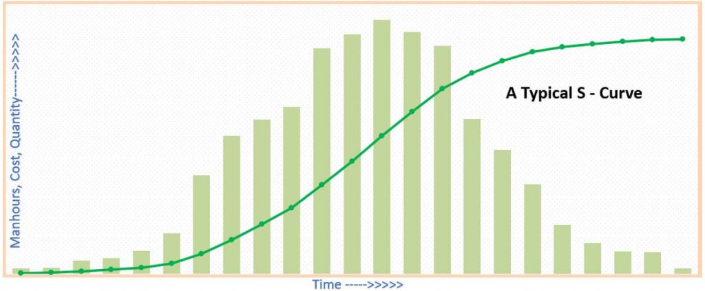
You can see it is quite flat initially, so in the end, steeper in the middle is typical of most projects.
The curve represents the cumulative work done over time & hence the steepness or flatness gives us the rate of work overtime.
It is clear that you need fewer resources at the initial stage, but we call it the execution phase that needs the maximum of all the resources in the middle. The end is the same as the initiation phase.
Uses of S Curves
The best use of S curves is in Earned Value Management. A tool that helps the project manager and the team to understand the variance is any project in no time.
Earned Value Management
The earned value management system uses historical data to forecast the future.
Let us see how a combination of s curves help in determining the project important scenarios like;
- The project is on budget.
- The project is on schedule.
Earned value management helps to find out the slippages that ultimately alert the team to negotiate. It is a complete set of ongoing project information that tracks in the best possible scenarios. And more importantly, through S curves, anyone in the team can understand the status in a flash.
Below is the infographics representation to understand the system easily.
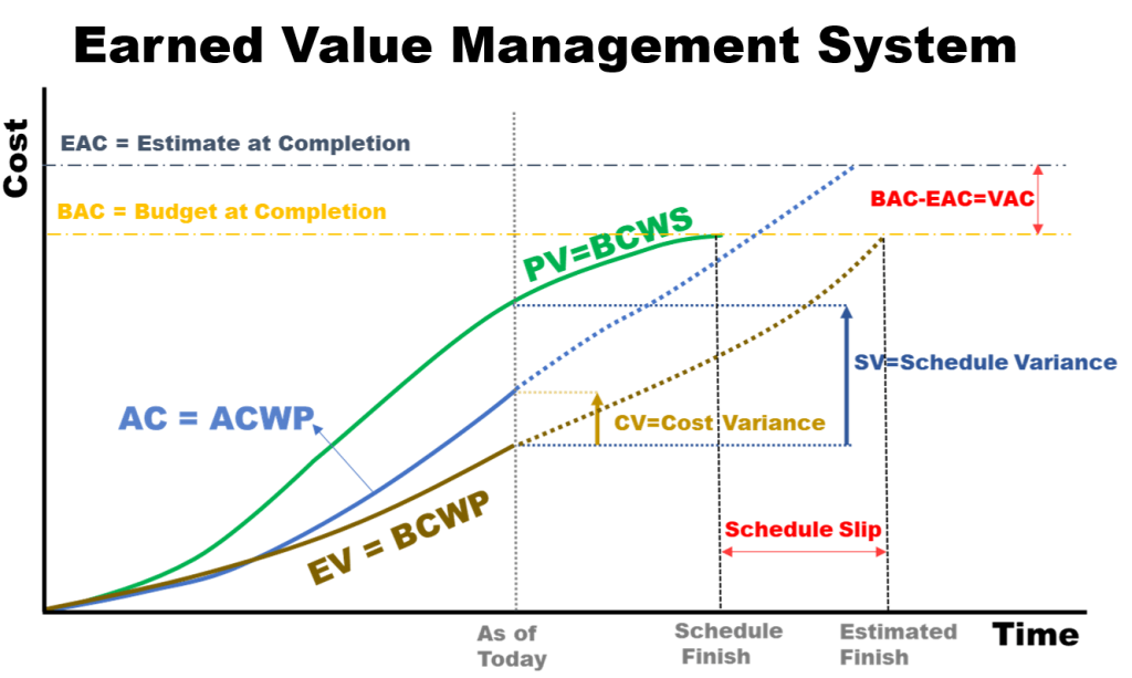
From this, you can easily calculate;
Schedule Performance Index – SPI
SPI = EV/PV, if
- SPI<1, the project is behind schedule
- SPI=1, the project is on schedule
- SPI>1, the project is ahead of schedule
Cost Performance Index – CPI
- CPI<1, the project is over budget
- If CPI=1, the project is on budget
- CPI > 1, the project is under budget
The same way we can calculate and drive the forecast from other formulas like,
EAC – Estimate at Completion =
- BAC/CPI
- AC + (BAC – EV)
- AC + [(BAC – EV)/(SPI x CPI)]
- AC + ETC
ETC – Estimate to Complete =
- EAC – AC
- New Estimate
VAC – Variance at Completion = BAC – EACTCPI – To Complete Performance Index =
- (BAC – EV) / (BAC – AC)
- (BAC – EV) / (EAC – AC)
More S Curves on a Project
Also, as I am working in Project Controls and my Project Manager is always demanding to show every possible data in the form of S – Curves like my weekly and monthly reports include the following S-Curves;
- Baseline S-curve
- Baseline Ranges (Banana Curves)
- Man-hours Vs. Time
- Recovery Plan Vs. Actual
- Cash Flow – Plan & Actual & Forecast
- Quantity Comparisons
- Progress and Performance Evaluation
- Manpower Histogram
- Percentage S-curves
It’s a great way to monitor project performance, variance & ultimately forecast to achieve the required goals.
You can have all history, current status & forecasting in one graph. S-Curves are easy to communicate & give clear indications about the health of the project.
Practical Examples of S Curves To better understand how to read S Curves, let me explain the below fig. scenario; at a particular date, we call it Data Date or Cut of Date.
The Actual Progress is below the Baseline Value, and that difference is called Variance. As you know, there are three common project tracking methods that are
- Person-hours
- Cost
- Quantity
Now, the Project Manager needs to look at and either need to increase the resources we call it Crashing or they need to Fast Track the activities that may lead to Risk issues.
But they need to act upon any of these to increase the work rate as overall project health is not acceptable for that particular time. They can use both simultaneously.

Real Case Study for Understanding S-CurvesNow, once everything is analyzed, we may need to submit a recovery plan, also called a mitigation plan, showing how we will catch up on the delays.
These curves are not as we have seen the typical one, but this may happen in practical scenarios. Here the client has asked to hand over a few major areas in the middle of the project.
That leads to differing work rates as in typical curves scenarios. As you see, the Green & Red are representing the Early Units and Late Units, respectively.
The combination of both gives us a Banana Curve. If the project slips below the Red zone, then it is an alarming thing that should be fixed immediately without any delay.
This is a real example where we were asked to submit Recovery Plan, where we were slipping below the Redline; you can see the Blue like for actual work.
We acted upon it immediately and submitted our action plan that included an increased workforce, an expedition of required critical materials delivery, and fast-tracking of several activities.
We presented this to Stakeholders, performed it, and wrote this blog the day we are as per our recovery plan without any negative Variance.
Man-Hours Versus Time S-Curve
Below is the graphical explanation of how we increased the manpower to catch up with the above delays for that particular project. No doubt there is a huge difference in planned, actual & recovery.
This may be because we overestimated Productivity Rates. As we were delayed in some critical material, we have to deploy the other skilled manpower simultaneously.
Some of our manpower becomes idle for the time being – waiting for material to be procured & to be delivered onsite.

How is an S-Curve Generated? First of all, we need to have a baseline plan. From this, we can generate early start & early finish S-curves.
You know a combination of both is called a Banana curve. This baseline program can be prepared in planning software like Primavera P6, MS Project and Asta, Tilos, SAP, etc. These may give you S Curves directly, or you need to use some third-party applications like Microsoft Excel to get it done after exporting data.
I normally use Primavera P6 and export data in MS Excel as it gives me the freedom to use the required visualization necessary to present to top management.
Before doing this, I prefer to see the result in Primavera P6 so that if there is an issue with it, as in Primavera, you can get S Curves of almost every type.
Wrap Up
S Curves are one of the most valuable Project Management Tools for reporting a project. As it is the best way to communicate with the Stakeholders, and you know, better communication is the key to any project’s success. That’s all about S Curve Project Management. Thank you for bearing with me. If you have any suggestions for improvement of this blog, please comment below. I will try to fill that gap where possible.
Thank you very much for explaining the stuff through practical experience. Would love to know more about how to draw it in MS Excel or if you can provide any template – Much appreciated.
Keep up good work.
Thanks for coming to my blog. The first comment is always lit to any blogger. Regarding your query, you can go to “Downloads” section and can get desired templates. If you need another as well please ping me again. I will try my best to arrange.
Here is the link for your convenience https://project.pm/download-stuff-related-to-project-management/
Thanks You Mate! I am blogger too but I love when you use practical experience. I suppose you have a good command on Project Management field. Keep Rocking!!
Thank you! Mate I would love to read your blogs too. Please share and also don’t hesitate if you have any suggestion for improvement.
Nice read! Thank you team for writing this piece based on some practical illustrations. Looking forward to know about Lean Project Management. Can you please write-up!
Thank you team for sharing this insightful experience. Practical s curve graphs gives confidence when developing these curves as most books have smooth curves which is not normally when you go and apply practically.
A good read dear. Thanks for write up. Would be nice if you could elaborate how to make s curve in MS Excel or refer ant video. A real blogger behind.
A bit grammar need to improve though. But natural you are.
Thanks you dear
I just shared it with my colleagues. Practical nature of S curve is not like smooth always – Good to know
Hello,
I really value what your doing. Its excellent. I try to send you an email but it was send back to me. i would be happy to be able to send you an email.
Earned value management always confuses me. Can you please write on it also? Though I got the idea from your post. Highly appreciated the good stuff on your website.
Thank you for Earned Value Management and defining the Banana curve in detail.
Can you please let me know using mathmatical equation can we forecast the cash flow based on the actual work done till date?
Without MSP or P6 schedule only knowing the end start date and end date what should be the cash flow?.
Cash flow is nothing but plotted against time as per your contract in the schedule. With only the start and end date, you cannot determine until unless you know what is happening in between.
There is no mathematical equation to tell you the cash flow, you have to draw it on the periodical order.
Hi,
I have an inquiry on how to get the delay in days from S curve if I have Baseline & Actual curve because as my understanding our S curve is created based on %. This is because previously my way of calculating the delays in days is based on a mathematical equation. But, now my client requests me to use S curve to identify the delay in days. Can I know how to use my S curve to get the delay in duration?
Hi
S curve is not a delay analysis tool but just an indication to see the delay. Yes, you can calculate the units on that particular period and can say to client that this much time to complete these units is delayed.
The need for project management software in a world that runs on modern technology cannot be overemphasized. It is evident that the use of a management tool would definitely be beneficial to your product.
Thanks for the basics of S curves, a informative material want s equipment histogram if any material regarding this greatly a beneficial thanks again.
Thanks, Sameer
You can find enough material from here…https://project.pm/download-stuff-related-to-project-management/