During my PMP exam preparations, I was a bit confused between a histogram and a Pareto chart. A Pareto Chart is just an advanced type of histogram. I will try to discuss all the concepts easily – Stay tuned!
Pareto Charts is also known as the Pareto diagram, Pareto analysis. It is one of the most important 7 Basic Quality Control Tools (Fishbone diagram, Scatter diagram, Histogram, Check sheets, Flow charts, Pareto Charts, Control Charts).
If you are a history guy, then you need to know that Kaoru Ishikawa – a professor at Tokyo University, was the first who emphasized these QC tools.
Each quality tool has its own functions and is used as per conditions. The Pareto Charts helps to perform a root cause analysis. Fishbone Diagrams (Cause & Effect, Ishikawa) & Scatter Diagrams are also used to perform root cause analysis.
Quick Navigation
Pareto Principle (80:20)
Vilfredo Pareto developed Pareto Principle, an Italian economist and sociologist who performed in Italy in the early 1900s.
One day while working in his garden, 80% of beans are produced by 20% of bean plants.
He realized that 80% of the wealth is concentrated in the hands-on only 20% of the people there. World GDP in Pareto perspective Richest 20% (82.70%), Second 20% (11.75%) Third 20% ( 2.30%) Fourth 20% (1.85%) Poorest 20% (1.4%)
And 80% of the problems incurred are caused by 20% of the major causes.
So, a Pareto principle is basically talking about the unequal distributions in the universe.
- 80% of your jobs are created by 20% of companies in the world.
- 80% of the friends don’t give you joy, but 20% do 🙂
- 80% of the shoes you have don’t use often but 20%.
- 20% of the syllabus you study is in exam paper 80% is not.
- 80% of the defects are due to 20% of the problems.
- 20% of my blogs generate more income than 80% of the rest.
This 80:20 rule is roughly calculated; it can be 90:10, 70:30, or even 99:1. Whatever the ratio is, but it will undoubtedly help to invest your efforts in most cases.
The Pareto Charts helps to find major causes first, and this way, we only concentrate only on the major ones. So, you will get to know that a few causes occur the majority of the defects.
How does the Pareto Charts help?
You will also see many occasional/seasonal problems that cause the effect occasionally. This is called the rule as a vital few over the trivial many.
- To draw a Pareto diagram is easy.
- We can quickly get significant effects and their causes.
- It eliminates the seasonal problem to save our time as we are not considering those anymore for that particular analysis.
- These charts also help during a report to top management as you can visualize the problem quickly.
How to Draw a Pareto Chart | Example
Before going for a graph, you need to be clear that the data can be arranged into categories, and each category is essential. Make sure to download the template here for a better understanding of the Pareto Charts Excel Template.
Step – 1. Collect raw data about the cause and effect (Problem)
Step – 2. Use checksheets and tally your data. This will help you to determine the units, like frequency, cost, time, etc.
Step – 3. Check the period to use the collected data like one year, one area or whole project or EPS, or even one week.
Step – 4. Define your category bars
Step – 5. Put causes on horizontal the x-axis and frequencies on the y-axis
Step – 6. Ensure the bar with the highest number of frequencies should be at the extreme left on the chart.
Step – 7. Add cumulative counts and lines by adding each percentage, and the right side has a maximum rate of 100%.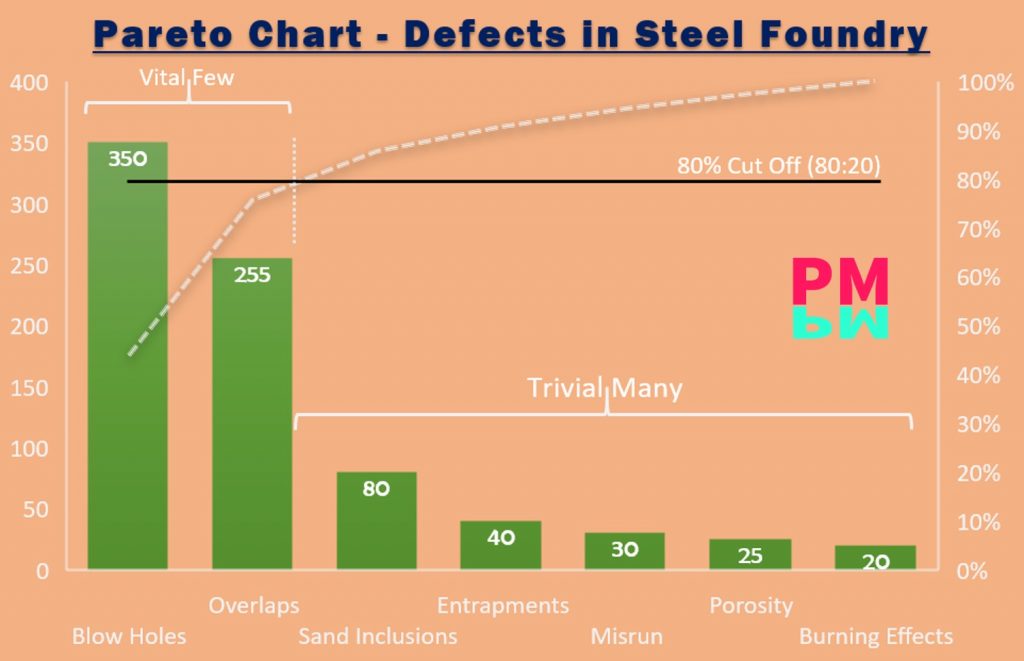
Example of a Pareto Chart
In the above example, you downloaded we got more than 1000 defective casting pieces. We started to segregate and used telly sheets to record the data. Some defects were so in numbers that we did not consider. This is one of the major benefits of Pareto Charts that you can ignore the less frequent causes.
After we got Blow Holes, Overlaps, Sand Inclusions, Entrapments, Misrun, Porosity, Burning Effects in our telly with high frequency.
We put all in MS Excel in descending order, like the most frequent on Blow Holes at the extreme right and so on.
We got a total of 770 defective pieces with repeated defects.
The Pareto chart is ready, and now you draw a cumulative sum line. The procedure to draw this line is as follows:
Calculate each category’s percentage to the total – 770; then, if you use MS excel, drop down or calculate one by one. Put these dots and connect. MS Excel will do all itself for you, but you can make it manually if you prefer it.
Pareto Diagram | Limitations
Pareto charts have some limitations; that’s why we need to choose any QC tool before implementing carefully. Let see what the significant limitations are;
- It is just a thumb rule and not fixed all the time. As I said earlier, it can be 70:30, 90:10, or even 99:1.
- Data should be segregated before going to start implementing the Pareto rule.
- It needs telly sheets to categorize data, and hence extra time and cost are required.
- We can get the root cause but not the solution.
- It will give the major causes on a specific period of time, and hence you may eliminate any other major cause that may hamper shortly.
Histogram Vs. Pareto Charts
Remember, a Pareto is a type of histogram. There is no need to prioritize a category in a histogram, and you will not find any cumulative curve. Here, you draw as per data and then analyze the peaks and find the problem. A histogram is just a frequency distribution on each bar with time.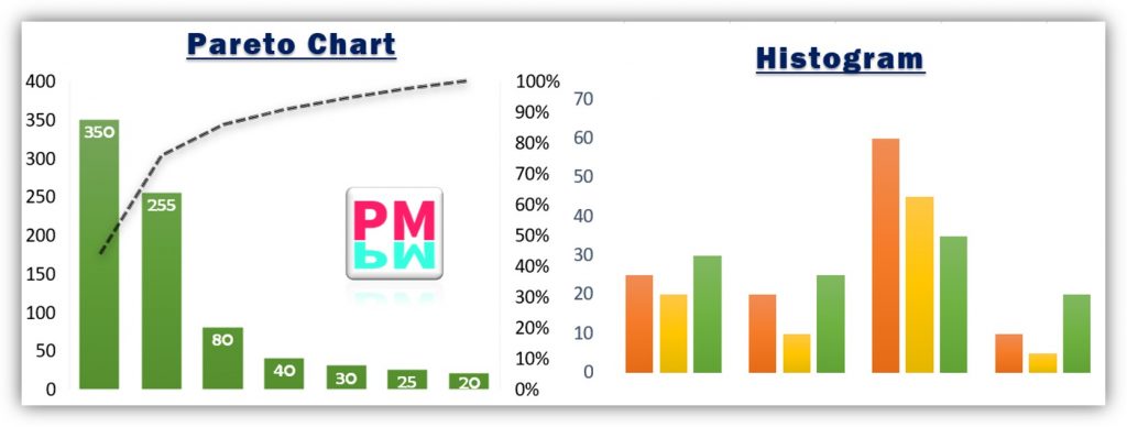
Wrap Up
No doubt, Pareto chart analysis is a time-saving tool in Quality Management. As we have seen through the Pareto chart example that careful analysis can save tons of your time. This is the best tool when you are running out of time. As a project manager, you can use this tool to perform delay analysis on your project to make quick decisions.
Love Diagrams and all about them !